Case Study
Prufrock Coffee Company
Responsive web design for Indianapolis-based coffee shop
-
Duration
100 hours
-
My Role
User research
Product development
UX UI design
User testing -
Tools
Figma
Google Docs
Google Sheets
About Prufrock
Prufrock Coffee Company is a coffee shop in Indianapolis, Indiana frequented by locals, college students and remote workers.
Located in the popular neighborhood of Broad Ripple, Prufrock has many competitors within a five-mile radius including chain stores such as Starbucks and other independent cafes.
The Challenge
While they utilize Google, Instagram and Facebook to communicate business hours, specials and day-to-day updates, they do not currently have a public website.
The Solution
Designing a user-friendly, responsive website for Prufrock will help match competitor standards and customer expectations, ensuring users can find all necessary information in one accessible place.
Design Process
Research
User Interviews
Competitive Analysis
Secondary Research
Define + Ideate
POV + HMW
User Personas
User Flows
Information Architecture
Design
Wireframes
Visual Design
Prototypes
Test
Usability Tests
Iterations
Research Process
User Interviews
I interviewed five potential users who frequent coffee shops via video calls or in person to understand the ways they interact with coffee shop websites, along with their challenges and expectations.
Questions
What features do you enjoy most on a coffee shop’s website?
Do you buy coffee or espresso beans from coffee shops?
What information do you typically look for on a coffee shop’s website?
Do you feel well-versed in various coffee/espresso-based drinks?
Describe the information you gather before going to a coffee shop you haven’t been to before.
Key Statistics
Do you go to a coffee shop at least once per week?
Do you enjoy seeing images of a coffee shop on their website?
Do you believe a coffee shop’s website has helped in deciding whether or not to visit?
Notable Insights
Users typically look for a coffee shop’s food/drink menu, hours and location on their website.
Users mostly order the same 2-3 drinks, but like to try the specialty drinks on occasion.
Most users have had to research the name of unfamiliar espresso drinks.
Most users only check the website of a coffee shop if they haven’t been to it before or if they’re looking for something specific i.e. merchandise or menu item.
Define + Ideate
Point of View + How Might We
POV
When planning a visit to a coffee shop, a user needs to easily find and gather the information necessary to effectively plan their visit.
HMW
How might we make it easier for people to efficiently gather the information they need before visiting a coffee shop?
User Personas
Aligning User Needs & Motivations
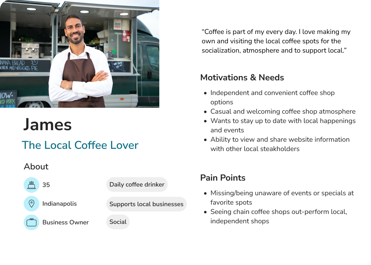
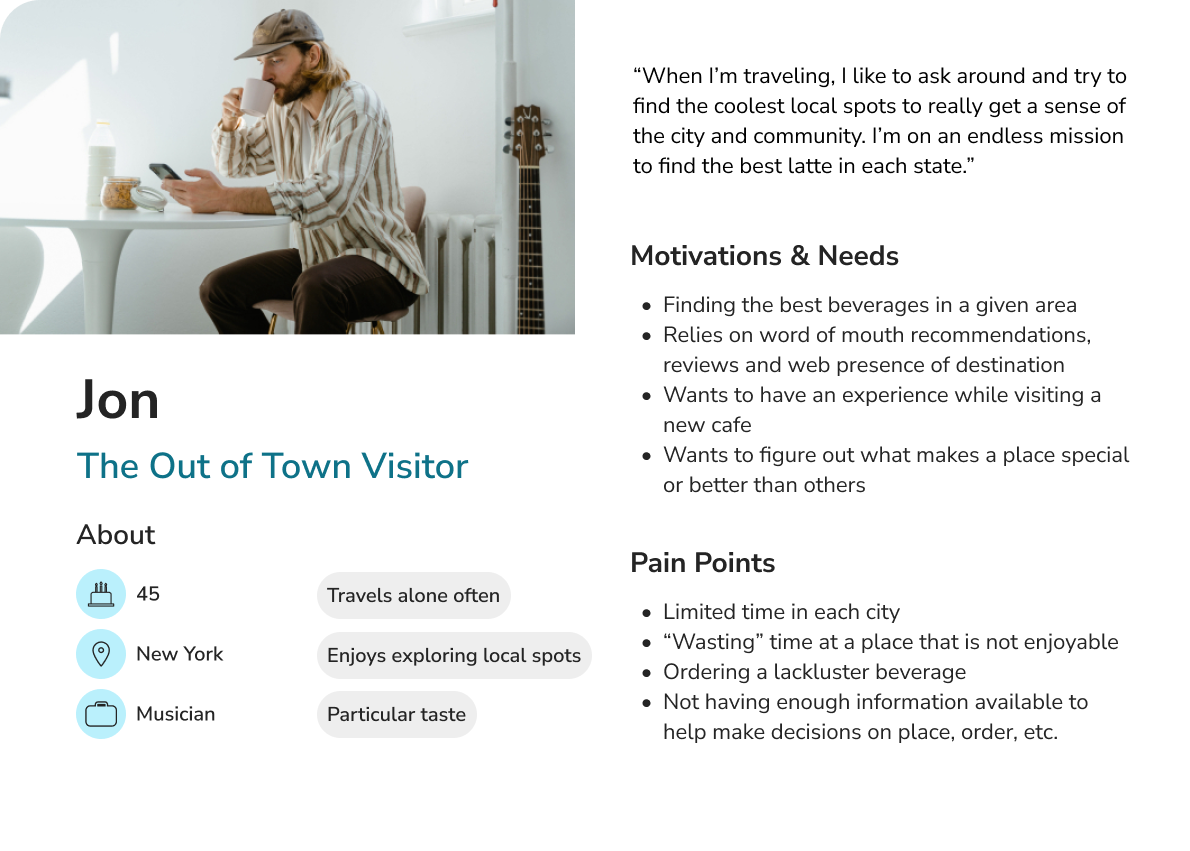
With user insights from interviews and supplemental knowledge gained from secondary research, three primary personas emerged: The Local Coffe Lover, The Remote Worker and The Out of Town Visitor.
From primary and secondary research, a set of features were established to meet users’ needs.
Features
Main features include events calendar, shop, and checkout.
Information Structure
Design
High Fidelity Wireframes
Preparing for Prototyping
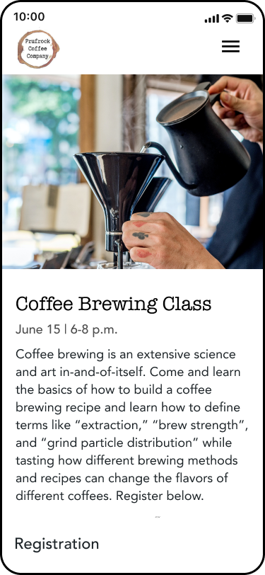
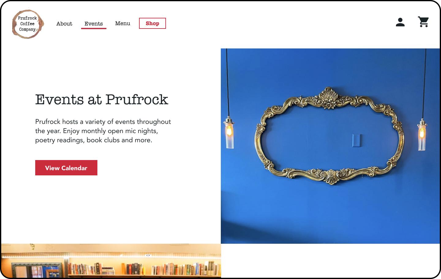
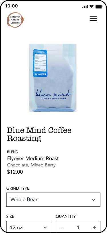
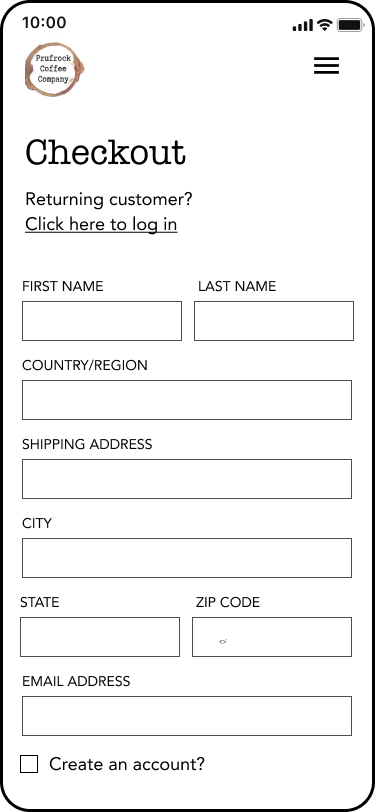
Using the site map as a blueprint, I planned for how users would flow through the main features of the website. From the perspective of each persona, I defined the specific scenarios and decisions each would take to achieve their goals.
I established two main task flows that aligned most with key features, user needs and product goals. After sketching the landing pages for each feature, I developed high fidelity wireframes and began prototyping.
Task Flows
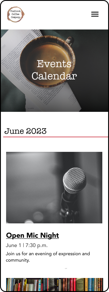
Register for an event
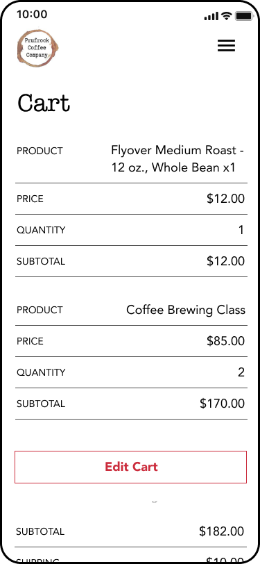
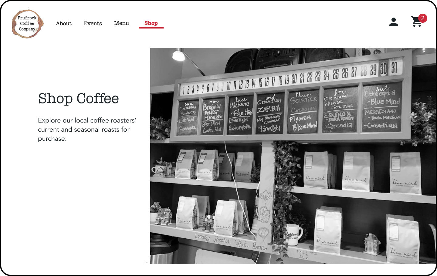
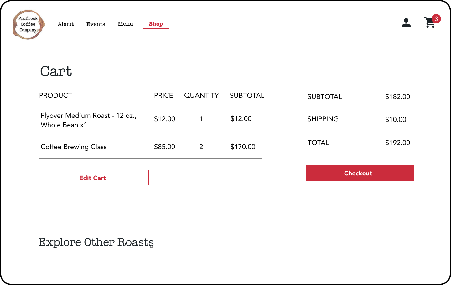
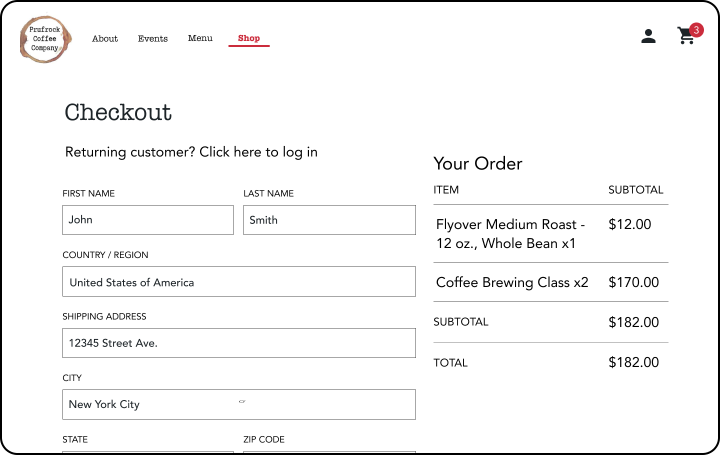
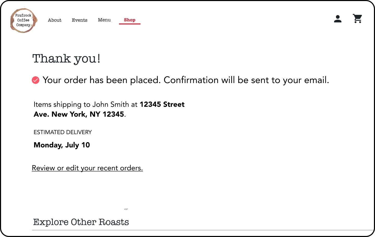
Purchase coffee beans
Event Registration
Mobile
Desktop
Coffee Bean Purchase
Mobile
Desktop
Test
Usability Test
Utilizing the prototypes, five test participants within the target audience navigated individually through the three key task flows.
Goal
Determine whether users can successfully and efficiently navigate through the outlined tasks on the Prufrock website.
Success Metrics
Users complete each task without significant errors
Users complete each task within a reasonable timeframe
Users provide positive feedback and feel they would enjoy using the product
Prototype Iterations
Event page listing:
User feedback: Under event calendar list, it was not clear to users whether they should should click on event image, event title or both.
Iteration: Apply hover fill feature to both event image and title so the user will have context that both are clickable. On mobile, the event title is underlined to show the title is clickable as well.
Original
Updated
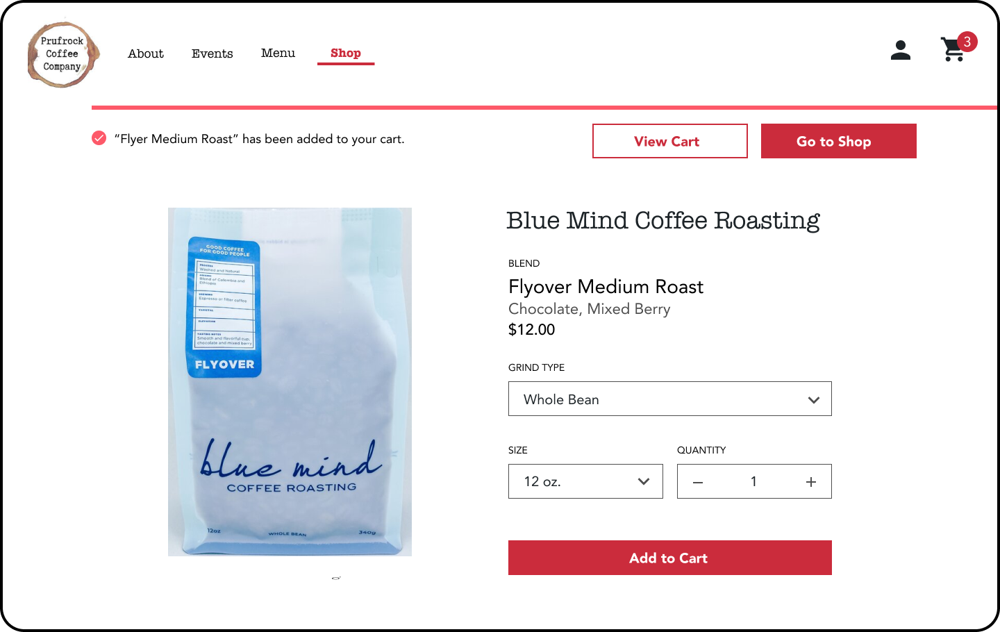
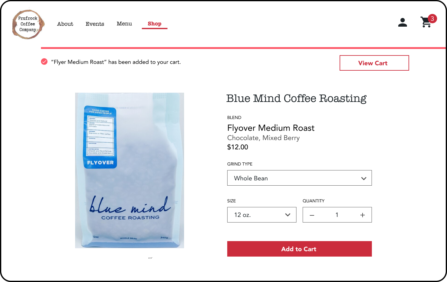
2. Shop purchase flow:
User feedback: Once the item is purchased, it was not clear to users whether they should click “View Cart,” “Go to Shop,” or navigate back to “Shop” from the navigation bar.
Iteration: For the purpose of the user flow, I removed the “Go to Shop” button, as it was not necessary for the user in order for them to navigate there and added an unnecessary user decision.
Original
Updated


